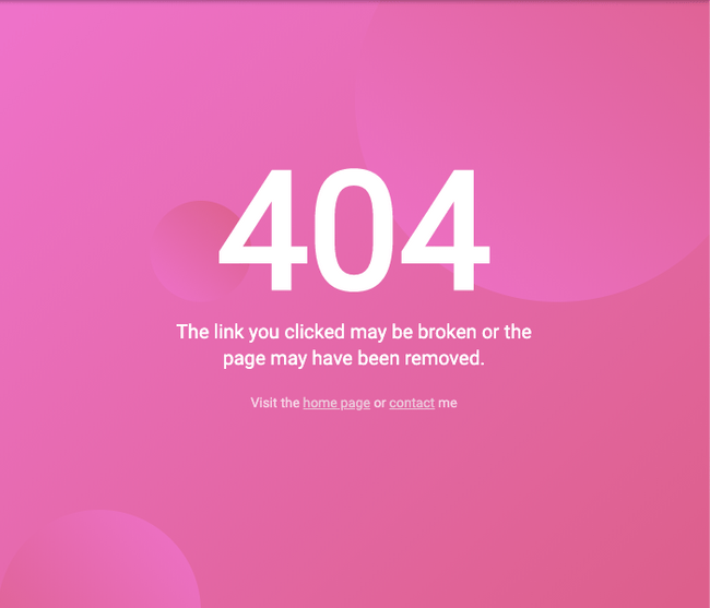
I've came across this simple and clean 404 page design created by @ildiesign and I thought I would make a quick tutorial on how to build something like this.
You can see the live version on Codepen:
https://codepen.io/FlorinPop17/pen/JjPvJzz
The HTML
As you might have noticed, we don't have any very complicated component on the page. It's basically just text and a couple of .circles:
<div class="container">
	<h1>404</h1>
	<p>
		The link you clicked may be broken or the <br />
		page may have been removed.
	</p>
	<small
		>Visit the <a href="www.florin-pop.com">home page</a> or
		<a href="www.florin-pop.com/contact">contact</a> me</small
	>
	<div class="circle small"></div>
	<div class="circle medium"></div>
	<div class="circle big"></div>
</div>
We've put everything in a .container that we will use to target the inner elements.
The CSS
First, let's deal with the basics for the body: font, colors, margin resets:
@import url('https://fonts.googleapis.com/css?family=Roboto&display=swap');

:root {
	--pink1: #ef73cb;
	--pink2: #dc5f89;
}

body,
html {
	margin: 0;
	overflow: hidden;
	position: relative;
}

body {
	align-items: center;
	background-image: linear-gradient(
		to bottom right,
		var(--pink1),
		var(--pink2)
	);
	color: #fff;
	display: flex;
	flex-direction: column;
	font-family: 'Roboto', sans-serif;
	justify-content: center;
	height: 100vh;
	text-align: center;
}
As you can see, we used CSS Variables on the :root for the two pink colors as we're going to use them also for the .circles.
We transformed the body into a flex element as we want to center the .container in the middle of the screen (with the help of the justify-content and align-items properties).
Because we're going to have absolutely positioned circles, which will be positioned outside the view, we need to set the overflow property to hidden. This will crop the circles and remove the scrolling. (Note: only set the overflow property to hidden on the body tag when you are certain that the content will not flow outside the browser's view, otherwise you might crop off important information).
Now let's style the other components too:
.container h1 {
	font-size: 10em;
	margin: 0 0 0.5em;
	line-height: 10px;
}

.container p {
	font-size: 1.2em;
	line-height: 26px;
}

.container small {
	opacity: 0.7;
}

.container a {
	color: #eee;
}

.circle {
	background-image: linear-gradient(to top right, var(--pink1), var(--pink2));
	border-radius: 50%;
	position: absolute;
	z-index: -1;
}

.circle.small {
	top: 200px;
	left: 150px;
	width: 100px;
	height: 100px;
}

.circle.medium {
	background-image: linear-gradient(to bottom left, var(--pink1), var(--pink2));
	bottom: -70px;
	left: 0;
	width: 200px;
	height: 200px;
}

.circle.big {
	top: -100px;
	right: -50px;
	width: 400px;
	height: 400px;
}
Nothing special for the text tags (h1, p, small), just a little styling to make them look better.
And for the .circles, we're setting the linear-gradient alongside the position and the size(width and height) of them - different for all of the 3 circles.
And we're done!
Conclusion
The great part of using CSS variables in this case is that you can swap out those two pink colors with any color you want and: Voila! You have another 404 page! 😉
Maybe the next step for this project would be to add some animations for those circles. Are you up for the challenge? 😃
Happy Coding! 😇
