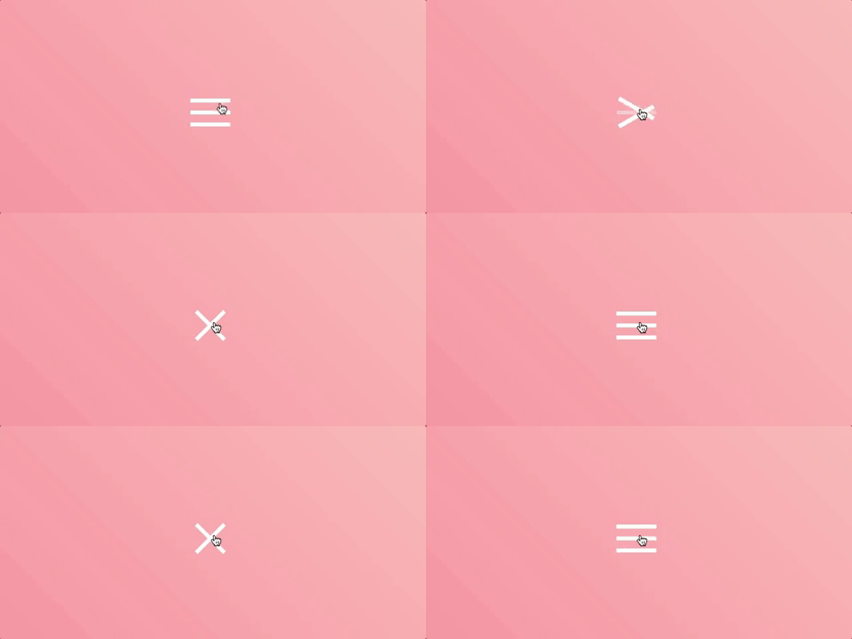
Today we’re going to create, from scratch, the hamburger button. Big CSS frameworks like Bootstrap and Foundation use this into their own products. We are also going to add a little CSS animation to make it look more “fancy”. :D
Note: in this tutorial we are only going to create the hamburger button with the animation. It won’t have any panel that appears showing a menu or something when you click the button. I’m going to add this in the following article, stay tuned! ;)
Bellow, you can see how the final product will look like.

As you can see, it has a smooth animation which will convert the hamburger “icon” into an X when the user clicks on it, and back to the hamburger when it’s clicked again.
HTML:
<button class="hamburger">
	<span class="line"></span>
	<span class="line"></span>
	<span class="line"></span>
</button>
The HTML is simple… we have a button which holds 3 span tags (the hamburger lines). I also added some classes which will be used in CSS.
CSS styling:
First, let’s style the button:
.hamburger {
    border: 0;
    background-color: transparent;
    cursor: pointer;
}
We are changing the default look of the button by removing the border, and setting the background-color to be transparent. The cursor: pointer property will show a pointer (obviously xD) mouse cursor when you hover over the button, it will be an indicator for the users that this item is clickable.
Next, styling the .line spans:
.hamburger .line {
    background-color: #fff;
    display: block;
    margin: 5px 0;
    height: 2px;
    width: 30px;
}
It is required to have a width, a height and a contrast background-color in order to make the lines visible. The display: block property, will put each line on a separate row. By default the span tag has the display property set to inline, which is not what we want in this case.
You can also use a div which is by default a block level element, or you can also use flexbox to align it easier, but for this example, we’re going to keep it simple.
Now… for the fun part:
The animation
Keep in mind that we have two possible states for the button: open and closed (referring to the state of the possible menu which can be shown by clicking the button)…
We already styled the closed state (the three stacked lines), so now we want to add another CSS class: .open to the button, which will allow us to have different styles applied for the lines when the button is opened.
.hamburger.open .line:nth-child(1) {
    transform: translateY(7px) rotate(45deg);
}

.hamburger.open .line:nth-child(2) {
    opacity: 0;
}

.hamburger.open .line:nth-child(3) {
    transform: translateY(-7px) rotate(-45deg);
}
The :nth-child selector matches every element that is the nth child, regardless of type, of its parent. This way we can target and style each .line individually:
- We move the first line 7px on the Y axis (top->bottom), and rotate it 45deg;
- We hide the second line by setting the
opacityto 0; - The third line is a basically a reflection of the first line. We move it -7px on the Y axis and rotate it -45deg;
In order to have a smooth animation, we need to add a transition property to the .line class, animating all properties for 100ms using the ease-in animation-timing-function.
.hamburger .line {
    /* ... */
    transition: all 0.1s ease-in;
}
Making it work using JavaScript
So far so good. We have the HTML markup, the CSS styling, but when the user clicks the button, nothing happens… This is because even though we styled the button when it has the .open class, we never added that class programmatically when the button is clicked.
We need to select the .hamburger button and add a click event listener to it:
const hamburger = document.querySelector('.hamburger');

hamburger.addEventListener('click', () => {});
The DOM elements have a classList property allowing us to toggle the .open class easily:
const hamburger = document.querySelector('.hamburger');

hamburger.addEventListener('click', () => {
    hamburger.classList.toggle('open');
});
With this in place, we are all set!

You can also find the code on Codepen.