It’s been a while since I wrote something on this blog and I want to apologize for that… :disappointed: I should have put more time in it as people requested it. BUT…

And I’m here to stay! :smiley:
Back to business!
For today I prepared a simple, yet interesting Testimonial Box Component which anyone can use on their personal website to improve visibility for their testimonials from old clients. This will help boost sells and/or get more clients.
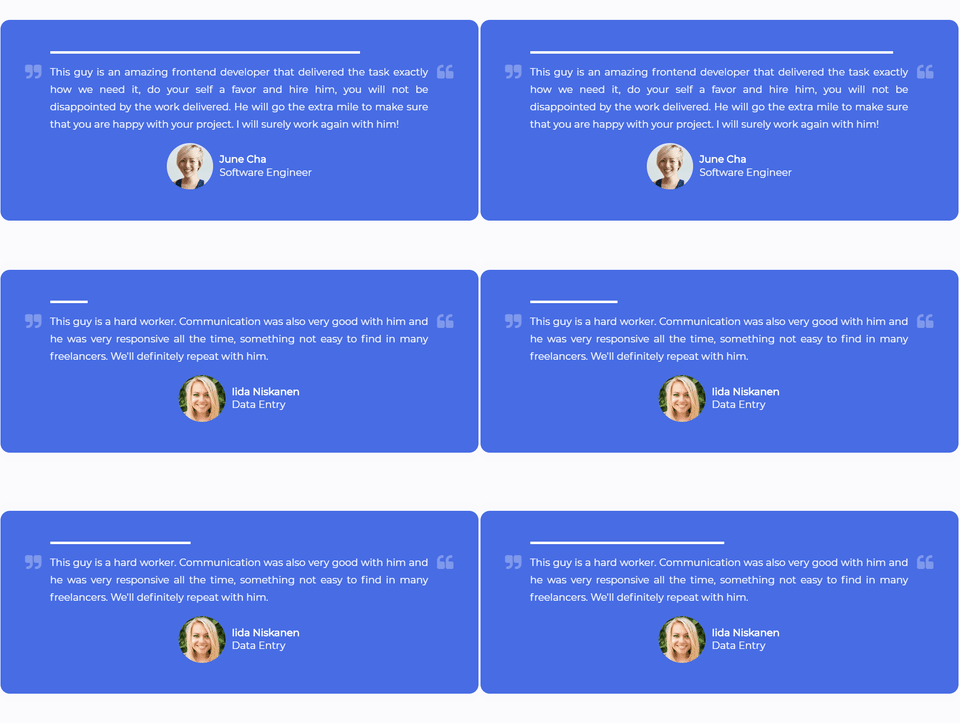
Here is a little preview of what we’re going to build:

Let’s start with the simplest part first:
The HTML
For this we’ll need a few things:
- A container which will hold the entire markup
- The testimonial text
- The logo and the client details (name and role)
<div class="testimonials-container">
    <p class="testimonial">Testimonial text - fill in your own text here</p>
    <div class="centered-items">
        <img class="logo" src="add_logo_url" alt="logo" />
        <div class="user-details">
            <h4 class="username">John Doe</h4>
            <p class="role">Blogger</p>
        </div>
    </div>
</div>
As you can see I added a class each tag. This way we can easily target them in the CSS in order to style them. Also, we have a centered-items div. As it’s very easy to center align items within a flex container, we’re going to create one.
We’ll add few more components in the future, but first let’s style these… :)
CSS
Now, we’re going to style each of these small components individually. Don’t worry about the fact that there are multiple CSS declarations, we’ll going to break down the ones which aren’t that obvious. :wink:
@import url("https://fonts.googleapis.com/css?family=Montserrat");

.testimonials-container {
    background-color: #476ce4;
    border-radius: 15px;
    color: #ffffff;
    font-family: "Montserrat";
    margin: 20px auto;
    max-width: 768px;
    padding: 50px 80px;
}

.testimonial {
    line-height: 28px;
    text-align: justify;
}

.centered-items {
    display: flex;
    align-items: center;
    justify-content: center;
}

.logo {
    border-radius: 50%;
    height: 75px;
    width: 75px;
    object-fit: cover;
}

.user-details {
    margin-left: 10px;
}

.username {
    margin: 0;
}

.role {
    font-weight: normal;
    margin: 2px 0;
}
As you can see, most of the CSS is pretty basic, we have the design or non-structural styling (font, color, background-color) on the container div. This way all the inner tags will inherit the styles and we won’t have to declare these styling for all of them.
Next we have some structural styles like padding, margin, height, width, max-width -> these will deal with the alignment of the items within the design. Pretty basic, eh? :stuck_out_tongue:
However there are few things I want to note:
- In the top, we imported the Google Font - Monserrat which we used to add a nice font to all of our text which is inside the container.
- For the
testimonials-containerdiv we havemax-widthand also amargin autoproperty -> it will center nicely the entire container. - To make the logo image round we used the same
widthandheighton the img tag and also we have aborder-radius: 50%-> this will turn the image into a perfect circle. Also, there is a special property:object-fitset tocover-> this will: “fill the height and width of its box, maintaining its aspect ratio but often cropping the image in the process” - perfect for what we need! (Source: CSS-Tricks).
As of now, we have a fully designed Testimonial Box. You could take this and run with it! :smile:

But if you decide to stick around, we’ll going to add a little bit of JavaScript to it and also some Animations - uuuh! :stuck_out_tongue:
JavaScript
You might want to have the option to post multiple testimonials inside your component, right? (who wouldn’t?)
This is pretty easy to do. Let’s break it down in few simple steps:
- Create a JavaScript array which will hold objects with all the changing data (name, position, photo, text)
- Add a function which will “inject” the data from above into the HTML markup
- Create a
setIntervalwhich will update the markup eachxmiliseconds (in our case - 10000ms which are 10 seconds)
const testimonials = [
    {
        name: "John Doe",
        position: "Marketing",
        photo: "add_photo_url",
        text: "Testimonial Text",
    },
];

// create a variable for each DOM element we want to target
const testimonialsContainer = document.querySelector(".testimonials-container");
const testimonial = testimonialsContainer.querySelector(".testimonial");
const logo = testimonialsContainer.querySelector(".logo");
const username = testimonialsContainer.querySelector(".username");
const role = testimonialsContainer.querySelector(".role");

// This idx act as a counter
let idx = 1;

function updateTestimonial() {
    // A little bit of desctructuring :wink:
    let { name, position, photo, text } = testimonials[idx];

    // Update the DOM elements
    testimonial.innerHTML = text;
    username.innerHTML = name;
    role.innerHTML = position;
    logo.src = photo;

    // Increment the counter
    idx++;

    // Reset the idx when it reaches the end of the array
    if (idx > testimonials.length - 1) {
        idx = 0;
    }
}

// Call the updateTestimonial functions each 10000ms / 10s
setInterval(updateTestimonial, 10000);
In order to be easier for me to explain the code adove, I’ve added some comments, make sure you read them! :)
You might noticed that we only have one object inside the array. I only added one here as I wanted to spare some space. The code is getting bigger and bigger. :innocent:
Something extra, yey! :smile:
So far we have the full design implemented and a some JS code where we loops through all the testimonials and update the data in the HTML markup. But… we’re not done quite yet. :stuck_out_tongue:
Let’s make sure that we provide to our visitors a better experience and in order to do that we’ll add 3 more things (easy stuff, don’t worry!):
- A progress bar with
animation-> this will provide a nice feedback to the visitors that there is something “loading” and they’ll have to wait to read more testimonials. (Otherwise they won’t know that there are multiple testimonials). - Adding 2 quote icons from FontAwesome.io to improve the design.
- Add some
media-queriesin order to improve the design on mobile.
Number 1 - HTML
Add the following code snippet right inside the .testimonials-container as it’s first child:
<div class="testimonials-container">
    <div class="progress-bar"></div>
    <!-- THE REST OF THE CODE     -->
</div>
CSS
We basically want a div with a fixed heigh (4px in our case) and full width which will have a @keyframes animation that will make it “grow” horizontally (on the X axis) for 10 seconds, and it will be an infinite loop.
.progress-bar {
    background-color: #fff;
    height: 4px;
    width: 100%;
    animation: grow 10s linear infinite;
    transform-origin: left;
}

@keyframes grow {
    0% {
        transform: scaleX(0);
    }
}
You can see that we also added transform-origin: left as it is by default centered and we don’t want that in this case.
Note: I used transform inside the keyframes because it animates faster than animating the height (animation stuff, don’t worry to much about it now :stuck_out_tongue: ).
Number 2 - HTML
Let’s add the two new icons we want inside the container. Basically we can add it anywhere in the DOM structure as we’ll position it absolute to stay exactly where we want to! (They don’t have a choice, ahaha!)
<div class="testimonials-container">
    <i class="fa fa-quote-right fa-quote"></i>
    <i class="fa fa-quote-left fa-quote"></i>
    <!-- THE REST OF THE CODE     -->
</div>
Note: In order for the icons to appear, make sure you import the corresponding FontAwesome CSS via a CDN inside your <head> tag. (You can find the link on their website).
To use the FontAwesome icons it’s pretty easy, is just required to add a tag (ussually an i tag) with two classes: fa (tell them that it’s a FontAwesome icon) and fa-your-icon (select the icon you want - they provide a list with all the available icons here).
I also added an fa-quote class as I wanted to style it a “little bit”. :relaxed:
CSS
.testimonials-container {
    /* the other css*/
    position: relative;
}

.fa-quote {
    color: rgba(255, 255, 255, 0.3);
    font-size: 28px;
    position: absolute;
    top: 70px;
}

.fa-quote-right {
    left: 40px;
}

.fa-quote-left {
    right: 40px;
}
We changed the color and the font-size for the icons and we positioned them at a certain location inside the container -> for this we need to add a position: relative to it and position: absolute to the icons. This might be a little confusing at first, but with practice you’ll get better at it! (Or I might cover it in more details in a future post, if you want, just let me know!)
And finally…
Number 3 - CSS
For this we’ll add the final piece of CSS code to improve the design on mobile devices. This is very important in the “era” we live in as more and more people are browsing the internet from their phones.
@media (max-width: 768px) {
    .testimonials-container {
        padding: 20px 30px;
    }

    .fa-quote {
        display: none;
    }
}
What we’re doing here basically is to remove the big padding from the container and hide the icons on mobile, as they will get behind the text and it won’t look very good. (You could try to find a better spot to place them, but I’ve chose to remove them on mobile)
Conclusion
Although it was a pretty simple component to make, it took longer than I expected to explain every tiny-bit of it. Nevertheless I hope it was useful for you and that you learned something new today! :innocent:
You can find the code live on Codepen and on Github.
If you have any questions, don’t hesitate to contact me. I’ll get back to you as soon as I can.
Also, don’t forget to follow me on Twitter where I’m sharing all the great (or not, :laughing: ) things that I’m building! :wink: