
Some of you might already know but for those who don’t, I’m starting a weekly Coding Challenge with all of you! 😄
This is how I’m planning to make it work: Every Monday I’m going to post an article about how I’m solving a different Coding Challenge by selecting a theme like: creating a new animation, a Sign in/up form, a Notes app, etc… (the sky is the limit). You are free to take a peek 👀 at my solution, BUT, you MUST come up with your own version in order to participate.
You might ask: “Why would you I want to participate?” - Well… you don’t have to, but this would be a very good way to: 1️⃣ test, 2️⃣ improve or 3️⃣ acquire new skills. I believe three reasons are enough, don’t you think? 😇
I’d suggest that you create your own version of the project on Codepen and also share it with me as I’d love ❤️ to see it! For that just Tweet 🐦 it at @florinpop17 alongside the link to the corresponding pen.
You can read The Complete Guide here.
Alright… so the Challenge for this week is (the title already spoiled it but… 😁):
Create a Sign in or Sign up form (or both)
Below you can see a demo of what I’ve created:
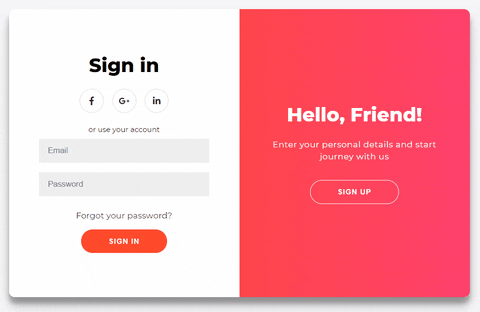
Truth to be told, I’ve struggled a bit with creating the animation 😅, but at the end I managed to make it work. 👍 I was inspired by this shot on Dribbble by SELECTO - they have some awesome designs, you should check them out!
Project description
Before we move to the actual code, I’d like to break down the things we’re going to have in the component. This will help as it will make the code we write much clearer.
We have 4 smaller screens/boxes inside the main component (the .container):
- The Sign In form
- The Sign Up form
- The Sign In overlay
- The Sign Up overlay
Also, at one moment in time you can see either:
- The Sign In form alongside the Sign Up overlay
- The Sign Up form alongside the Sign In overlay
In the overlay panels we have some text and a button - by clicking it you will bring up the other combination of screens and vice-versa. Check the GIF above one more time to see what I mean.
The overlay animation - explained
This is where it might be a little trickier, but I’ll do my best to explain so you can understand the logic behind it.
We have the following layers for the overlay component:
The overlay-container - this will display the visible area (more on this below) at a certain moment in time. It has a width of 50% of the total container’s width.
The overlay - this div has a double width size (200%) so it’s taking the full width of the main container. (200% * 50%= 100%. The 50% is from the .overlay-container above).
The overlay-panels - are the divs which are holding the actual content (the text and the button) we are seeing on the screen. They both have a position of absolute -> meaning that we can position them wherever we want in the .overlay component. One of the panels is positioned to the left and the other one is positioned to the right, both having a width of 50% of the .overlay component.
“Why do we need 3 layers?” you might ask… Well, let’s see how it would look like without the first layer:
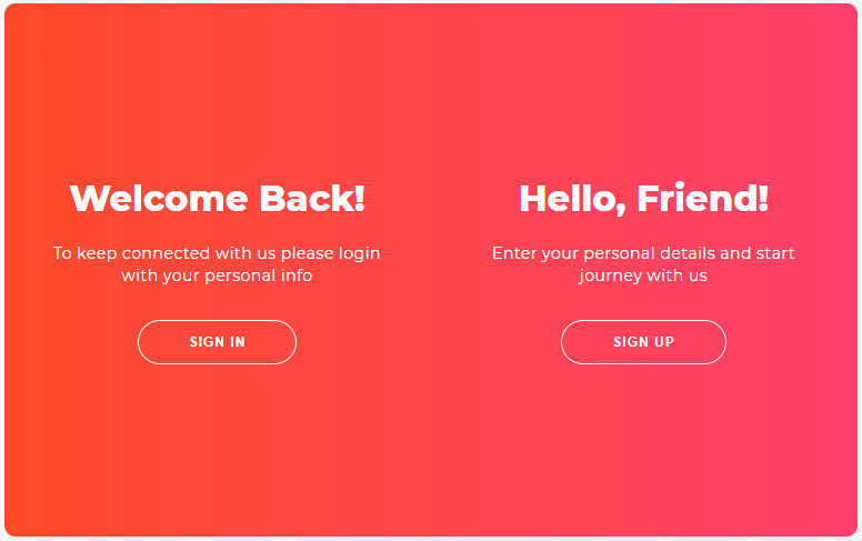
In the picture above you can see that both of the panels are “visible”, which is not what we want, and this is why we’re adding the .overlay-container to act like a “focus area” by allowing us to hide the panel which is overflowing, or which is out of its boundaries. This is why we needed the .overlay to be twice as big as the .overlay-container.
By moving around the .overlay-container, which also has a position of absolute, we can hide or show which panel we want.
It was a little bit confusing 😅, I’ll admit, but I hope I made it more clear.
The forms animation - explained
These aren’t difficult to understand at all. Basically we have again two containers - the .form-containers - each having a width of 50% and a position - absolute. We move both of them at the same time from the left to the right, and when they get behind the .overlay-container from above (while these are moving) we quickly change the z-index value so the Sign Up form (for example) will move on top of the Sign In form, and vice-versa. Magic to the eyes, but just some code logic behind! 😆
The HTML
Now that we have broken down the core “functionality” of the animation, it’s time to see the actual HTML code. Let’s start with the basic skeleton:
<div class="container" id="container">
    <div class="form-container sign-up-container">
        <!-- Sign Up form code goes here -->
    </div>
    <div class="form-container sign-in-container">
        <!-- Sign In form code goes here -->
    </div>
    <div class="overlay-container">
        <!-- The overlay code goes here -->
    </div>
</div>
The main div has a class of .container and also an id of container because we want to target this element in the JavaScript (more on this below). 😉
The Sign Up form
<div class="form-container sign-up-container">
    <form action="#">
        <h1>Create Account</h1>
        <div class="social-container">
            <a href="#" class="social"><i class="fab fa-facebook-f"></i></a>
            <a href="#" class="social"><i class="fab fa-google-plus-g"></i></a>
            <a href="#" class="social"><i class="fab fa-linkedin-in"></i></a>
        </div>
        <span>or use your email for registration</span>
        <input type="text" placeholder="Name" />
        <input type="email" placeholder="Email" />
        <input type="password" placeholder="Password" />
        <button>Sign Up</button>
    </form>
</div>
The Sign In form
<div class="form-container sign-in-container">
    <form action="#">
        <h1>Sign in</h1>
        <div class="social-container">
            <a href="#" class="social"><i class="fab fa-facebook-f"></i></a>
            <a href="#" class="social"><i class="fab fa-google-plus-g"></i></a>
            <a href="#" class="social"><i class="fab fa-linkedin-in"></i></a>
        </div>
        <span>or use your account</span>
        <input type="email" placeholder="Email" />
        <input type="password" placeholder="Password" />
        <a href="#">Forgot your password?</a>
        <button>Sign In</button>
    </form>
</div>
We also have a few classes on each div:
- The
.form-containerclass will contain the CSS which is duplicated for both the.sign-in-containerand.sign-up-containerclasses; - the 2 different classes (mentioned above) will contain the CSS which is different.
This way we avoid having to write the same CSS code twice and we use the power of being able to add multiple classes.
You might have also noticed that the i tags have some classes. These are because we are using FontAwesome for the icons. Read more about them on their website.
The overlay container
<div class="overlay-container">
    <div class="overlay">
        <div class="overlay-panel overlay-left">
            <h1>Welcome Back!</h1>
            <p>
                To keep connected with us please login with your personal info
            </p>
            <button class="ghost" id="signIn">Sign In</button>
        </div>
        <div class="overlay-panel overlay-right">
            <h1>Hello, Friend!</h1>
            <p>Enter your personal details and start journey with us</p>
            <button class="ghost" id="signUp">Sign Up</button>
        </div>
    </div>
</div>
Same as above, we have a common class .overlay-panel and two different classes: .overlay-left and .overlay-right.
Also, we have ids for the buttons as we’re going to add an onClick eventListener for both of them in the JavaScript.
The JavaScript
Usually we cover the CSS before the JS part, but this time is easier to show and explain the JavaScript code first as it will help you understand the CSS we’re going to have later on.
const signUpButton = document.getElementById("signUp");
const signInButton = document.getElementById("signIn");
const container = document.getElementById("container");

signUpButton.addEventListener("click", () => {
    container.classList.add("right-panel-active");
});

signInButton.addEventListener("click", () => {
    container.classList.remove("right-panel-active");
});
As explained above, we add the event listeners and when the buttons are clicked we add or remove the .right-panel-active class (not the best name for the class, but it’s the best I got at the moment 😆) - this class will be used to style the sub components differently as we have two screens.
The CSS
First, we have the base CSS for the basic components:
h1 {
    font-weight: bold;
    margin: 0;
}

p {
    font-size: 14px;
    font-weight: 100;
    line-height: 20px;
    letter-spacing: 0.5px;
    margin: 20px 0 30px;
}

span {
    font-size: 12px;
}

a {
    color: #333;
    font-size: 14px;
    text-decoration: none;
    margin: 15px 0;
}

button {
    border-radius: 20px;
    border: 1px solid #ff4b2b;
    background-color: #ff4b2b;
    color: #ffffff;
    font-size: 12px;
    font-weight: bold;
    padding: 12px 45px;
    letter-spacing: 1px;
    text-transform: uppercase;
    transition: transform 80ms ease-in;
}

button:active {
    transform: scale(0.95);
}

button:focus {
    outline: none;
}

button.ghost {
    background-color: transparent;
    border-color: #ffffff;
}

form {
    background-color: #ffffff;
    display: flex;
    align-items: center;
    justify-content: center;
    flex-direction: column;
    padding: 0 50px;
    height: 100%;
    text-align: center;
}

input {
    background-color: #eee;
    border: none;
    padding: 12px 15px;
    margin: 8px 0;
    width: 100%;
}

.social-container {
    margin: 20px 0;
}

.social-container a {
    border: 1px solid #dddddd;
    border-radius: 50%;
    display: inline-flex;
    justify-content: center;
    align-items: center;
    margin: 0 5px;
    height: 40px;
    width: 40px;
}
Few things to note here:
- We are styling the elements directly (h1, p, a). Usually you wouldn’t do that as it might get mixed up with other styles, so it’s good to add a class to each of them. But for this example is working ok because we only have these elements on the page.
- We have a little
transitionon thebutton-> when it’s clicked, the active state is triggered so we make it a little smaller -> Nice and simple clicking effect 🆒! - The
formis aflexcontainer as we want to center everything within it and it’s easy to do that withflexbox. You’ll see below that it’s used a few more times.
The .container CSS:
.container {
    background-color: #ffffff;
    border-radius: 10px;
    box-shadow:
        0 14px 28px rgba(0, 0, 0, 0.25),
        0 10px 10px rgba(0, 0, 0, 0.22);
    position: relative;
    overflow: hidden;
    width: 768px;
    max-width: 100%;
    min-height: 480px;
}
Relativepositioned because we’ll haveabsolutepositioned children elements (explained why, above).Overflowis set tohiddenbecause we have set aborder-radiusand we don’t want the child elements to break this radius and be displayed outside of the.container.
Now for the fun part, the .form-container and the related styles:
.form-container {
    position: absolute;
    top: 0;
    height: 100%;
    transition: all 0.6s ease-in-out;
}

.sign-in-container {
    left: 0;
    width: 50%;
    z-index: 2;
}

.sign-up-container {
    left: 0;
    width: 50%;
    opacity: 0;
    z-index: 1;
}

.container.right-panel-active .sign-in-container {
    transform: translateX(100%);
}

.container.right-panel-active .sign-up-container {
    transform: translateX(100%);
    opacity: 1;
    z-index: 5;
    animation: show 0.6s;
}

@keyframes show {
    0%,
    49.99% {
        opacity: 0;
        z-index: 1;
    }

    50%,
    100% {
        opacity: 1;
        z-index: 5;
    }
}
Note the following:
- The
animation(show) which is responsible for the changing thez-indexof the.form-containers as discussed above. We go by having the z-index 1 from0-49.99%and having it at 5 from50-100%. These ranges are used because we want it to change fast. - We use the
.right-panel-activeclass to move around the.form-containers when the buttons are clicked.
And finally, the .overlay-container and related styles:
.overlay-container {
    position: absolute;
    top: 0;
    left: 50%;
    width: 50%;
    height: 100%;
    overflow: hidden;
    transition: transform 0.6s ease-in-out;
    z-index: 100;
}

.container.right-panel-active .overlay-container {
    transform: translateX(-100%);
}

.overlay {
    background: #ff416c;
    background: -webkit-linear-gradient(to right, #ff4b2b, #ff416c);
    background: linear-gradient(to right, #ff4b2b, #ff416c);
    background-repeat: no-repeat;
    background-size: cover;
    background-position: 0 0;
    color: #ffffff;
    position: relative;
    left: -100%;
    height: 100%;
    width: 200%;
    transform: translateX(0);
    transition: transform 0.6s ease-in-out;
}

.container.right-panel-active .overlay {
    transform: translateX(50%);
}

.overlay-panel {
    position: absolute;
    display: flex;
    align-items: center;
    justify-content: center;
    flex-direction: column;
    padding: 0 40px;
    text-align: center;
    top: 0;
    height: 100%;
    width: 50%;
    transform: translateX(0);
    transition: transform 0.6s ease-in-out;
}

.overlay-left {
    transform: translateX(-20%);
}

.container.right-panel-active .overlay-left {
    transform: translateX(0);
}

.overlay-right {
    right: 0;
    transform: translateX(0);
}

.container.right-panel-active .overlay-right {
    transform: translateX(20%);
}
- the
.overlayhas a gradient background, I used UI Gradients to get it; .overlay-leftand.container.right-panel-active .overlay-righthave a-20%and20%translation on the X axis. This is because I wanted to add a little effect to the text when it’s displayed, as if it’s coming from outside (sort of) 😃;
Other than that… Nothing! We covered everything. We’re done! 👏
Conclusion
This post was a long one, wasn’t it? 😅 Nevertheless, I’d hope you learned something from it. Don’t forget to create your own version and share it with me on Twitter: @florinpop17.
You can find the live version of the project we’ve built on Codepen.
Also you can suggest what I should build for the next Challenge in this Google Form.
Thank you 🙏!